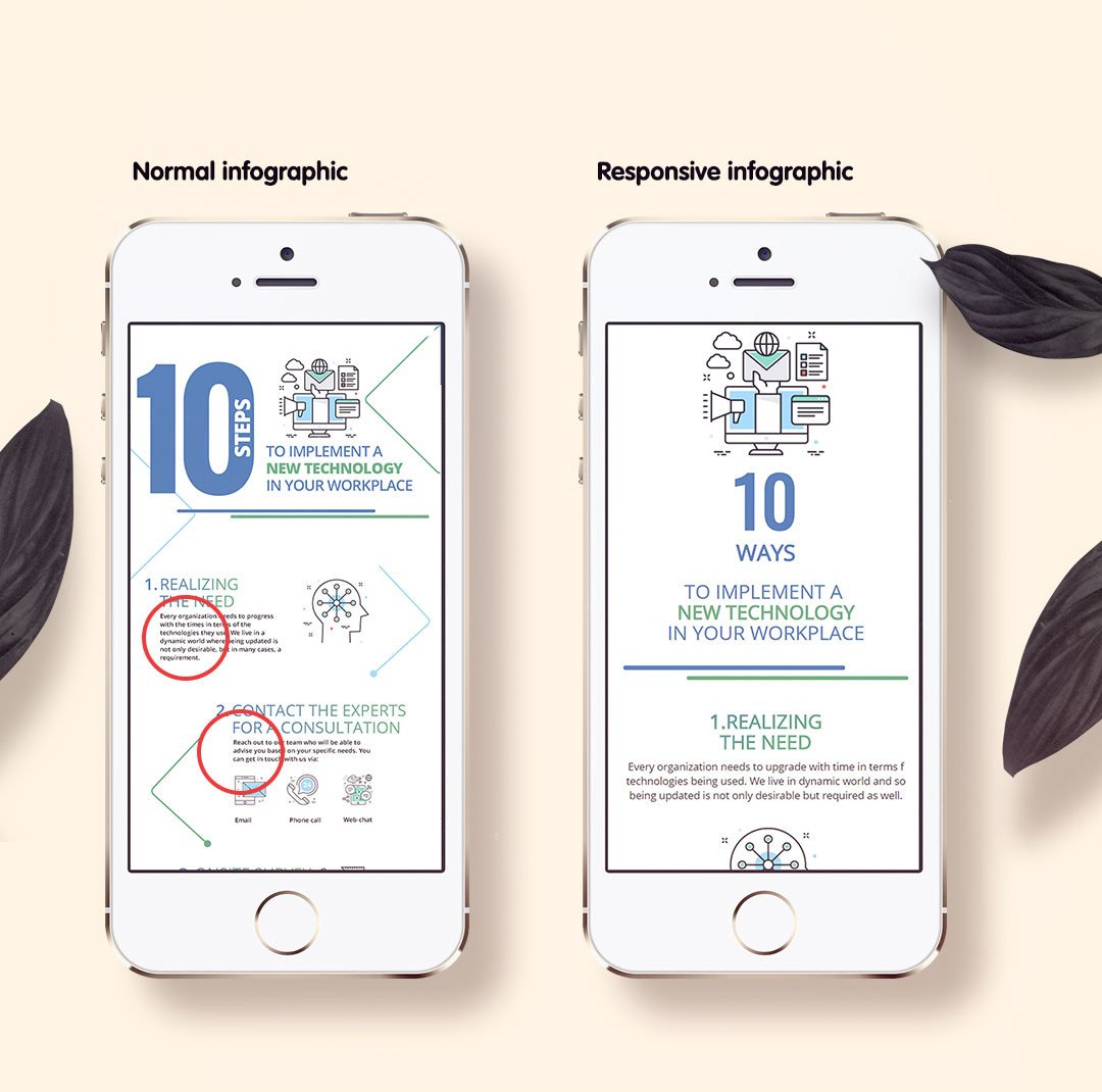
The other day I sent one of the infographics I designed, to a friend of mine and he happened to open it up on his phone. As I thought, he simply hated it. On his phone, he could not understand a word of it, as the image appeared too small. The way infographics are designed in the industry, they are not responsive and with the world going mobile, infographics are losing their charm. Once they ruled the industry as visual information is better understood than the textual one, but the times have changed.
What if it could be changed. What if your infographics could adjust to screen size? The possibilities will be endless. What if the same visual appeal can be carried irrespective of the screen and resolution used?
The second biggest challenge or as Marketing Guru Neil Patel rightly mentioned in his post: https://www.quicksprout.com/2017/07/21/heres-how-to-perfectly-optimize-your-infographic-for-seo/
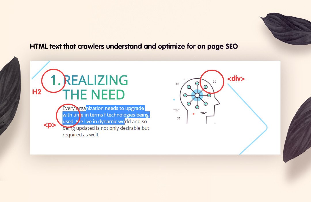
The article reads like” Let me start by saying infographics are technically just images. They are typically saved in image formats such as JPEG, PNG, GIF, etc. Of course, they’re much more robust and contain far more information than a regular image, but that’s how Google views them. This is important to know because Google can’t “read” images like it can text-based content such as a blog post. ”
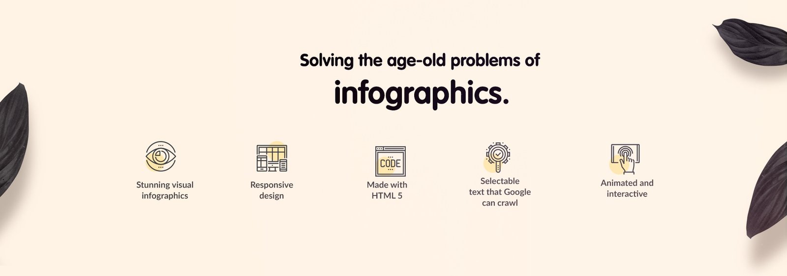
Now there is a solution and that too without breaking a bank. With HTML based infographics we are able to solve this age-old problem with infographics while ensuring that they are stunning to look at and yes, they are SEO friendly as well. Majorly all the text included is crawlable by search engine crawlers. It can have HTML tags like H1, li etc. The infographics we design in this category are mobile responsive and can have animation as well. We have successfully implemented these infographics on WordPress based websites as well. Moreover, they are much lighter on the page than a big image or a gif.